How Bad Presentations Lead Us to Create Presentation Patterns
My first speaking experience at a technical conference was in 1997 at the Borland International Developers Conference (BorCon) in Nashville, TN. Despite teaching lots of technical training courses as part of my day job, speaking in a formal setting was nerve racking, and my performance was abysmal due to lack of experience. I had no illusions that I knew what I was doing.
But I kept doing it, and gradually got better. By 2004, I had spoken at approximately 25 conferences, and felt like I had a pretty good handle on the content of the presentation. Like many technical presenters, I paid little attention to the slides, which traditionally were thrown together at the last minute. Slides at technical conferences were viewed as a necessary evil. Most presentations heavily featured demonstrations of technical prowess, illustrating points using developer’s tools. The tradition was to get all the examples working, then spend a hour banging out an outline using slides to serve as a guide through the topic. These slides were as much for the speaker as for the audience, as a reminder of what to talk about next. Occasionally, if I were feeling ambitious, I might include a diagram or other visual aid, but my slides were almost exclusively Bullet-riddled Corpses, ladened with Floodmarks for both my company and the conference. Three things happened that changed my presenting style forever and lead me to collaborate on Presentation Patterns.
Dead Demos
One of the seminal events in my speaking career was my introduction to the No Fluff, Just Stuff conference series, which came about when my publisher at the time introduced me to the organizer, Jay Zimmerman. As I started on the No Fluff, Just Stuff tour, my slide style had evolved very little. I had prettier backgrounds, and had started thinking at least a little about the visual aspect, but I was still in Technical Presenter Mode: show a few slides as introduction, quickly bounce over to the tool(s) that illustrated technical points, and spend most of my time interacting with the tool live. Every once in a while, I would bounce back over to the slides to make sure that I had covered all that I had promised, advancing a few slides to get to the next main point, then off to the tools again. My slides circa 2004 looked like Figure 1, which is a slide from my presentation Power Regular Expressions in Java.
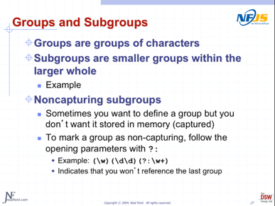
Figure 1: A 2004 slide, filled with what I would now call Floodmarks
Like many technical presenters, I felt the need to show examples in the tools that created them – note the “Example” bullet point in Figure 2, which was my indicator to bounce over to a software development tool to show an example. Mostly I was showing computer source code, which is plain text, but felt compelled to show it in the tool that created it. I was also careful to execute the code after I talked about it, by way of proving that what I was showing actually worked. As the tools and techniques I was presenting became more complex and nuanced, so did the demonstrations I was performing live. The ultimate expression of this style of presenting was a presentation named Advanced Selenium, about a testing tool named Selenium. To demonstrate the tool, I needed no less than five applications running, using several browsers, bouncing back and forth between the applications to show various aspects. From a technical standpoint, the talk was a tour-de-force, illustrating some mind-blowing techniques and general coolness to the audience. I viewed the proliferation of applications and views as a bonus, allowing the audience deep insight into what was going on. But all the bravado with tools was really just an ego boost to me, to show how proficient I was with dealing with complex tools and concepts.
One of the killer features of the No Fluff, Just Stuff conference is the excellent feedback form, which the attendees always filled out in great detail. One of the feedback forms from the Advanced Selenium talk complained about the amount of bouncing around and the general chaotic nature of the presentation. What I viewed as a bonus to the audience was actually a distraction: they couldn’t really tell what I was doing because I was bouncing around so much. It made me realize that most of the activity within my presentation didn’t really make it more effective, but rather stroked my ego: it was a demonstration of how much I could maintain my concentration during a performance rather than the best way to convey information. That evaluation form made me reconsider doing primarily live demonstrations; in modern terms, I accidentally implemented the Dead Demo anti-pattern rather than the Live Demo pattern. My presentations had all the hallmarks of a Dead Demo: I wasn’t showing something that only made sense within a tool, I was spending lots of time getting everything set up at the expense of real content, and I was mostly showing how effectively I could use tools while an audience watched. In other words, it was more about me than the audience.
I had come to this style of presentation honestly, because I had a long experience with technical training classes. In a classroom setting, where I was teaching a group of adults how to use a particular tool, the Live Demo style worked great because they students were required to use the tool for exercises. Having me stand up front and build bespoke things using a tool was in fact the best way to convey that information, and still lives as one of the positives of the Live Demo pattern. What I hadn’t realized was that the context of my talks had changed, from the training room to the conference hall. For conference presentations, the focus is less on repeatability than information density, and my now Dead Demo presentations didn’t cut it. I had missed another of our patterns, Know Your Audience.
The No Fluff, Just Stuff evaluation made me realize the error of my ways, and I gradually started building more formal presentations rather than leaning on live performance to entertain the audience. I found that I could greatly increase the information density of my presentations because I wasn’t wasting time typing and using tools in front of the crowd.
“Old Fashioned”
In Presentation Patterns, we distinguish between an InfoDeck, which are slides designed for reading by flipping through them, from a Presentation, which leverages time via slide animations and transitions. By 2007, I had largely given up doing Dead Demos, but like many technical presenters, I made the mistake of presenting InfoDecks; I had not yet caught onto this important distinction. However, I had started to think more about the visual of my slides.
Another epochal event occurred on the No Fluff, Just Stuff tour in 2007. By this time, I had added quite a lot of visual interest in my presentations without adding much value. I realized that using the default templates and fonts was a bad idea (now captured as the Defy Defaults pattern), so I had customized my background, inspired by a famous painting by Mark Rothko, an abstract expressionist painter. I had also switched from Powerpoint to Keynote, allowing me a broader visual palette. Basically, most of my slides looked like the one in Figure 1.
Figure 2: A slide from my Productive Programmer talk, circa 2007
I was proud of the visual density, including the little “tip box” that animated in from the top right corner to consolidate the advice on the slide. But, lo and behold, I received an evaluation from a No Fluff, Just Stuff attendee that said, in essence, that while the content was good, the presentation was “old fashioned”. Old fashioned!?! How could he mean old-fashioned? I was using a custom background and state-of-the-art three dimensional bullets for my slides!
That evaluation caused me to rethink the visuals for my presentations from the ground up, and caused me to start researching the current state of the art in presentations. This exploration lead me to Presentation Zen and Slide:ology and a fundamental rethinking of what my presentations could look like. This single revelation had the most profound effect on how I built slides. It literally allowed me to see this tool I had been using for a decade in an entirely new light.
My 2009 presentations were a combination of highly visual, raw, and clumsy, as I was learning a new presentation style while still presenting at 30 or 40 conferences a year. I’m embarrassed by how long it took me to understand the animation distinction between after previous slide and with previous slide, but I gradually learned all the hidden parts of presentation tools. My presentations gradually got better as I continued to listen to feedback and honed my new visual style. While those presentations look primitive today, my modern style was starting to find itself through those early talks and keynotes. One of the reasons I’m successful today is the opportunity do it poorly long enough to practice and get better, which is the real key to learning.
Toward Patterns
One of the side effects of speaking at numerous conferences is exposure to lots of other speakers and presentations. In particular, I started noticing presenters who hadn’t moved on from the Bullet-riddled Corpse, Dead Demo style of presentation. During one such voyeuristic attendance to one of my colleague’s presentations, I was struck by how stultifying seeing long lists of bullets were to the audience, and the phrase Bullet-riddled Corpse popped into my head as a way of describing that feeling. What I had done was identify my first anti-pattern for presentations, which was a collision of worlds for me. In the software world, the concept of Design Patterns is widely used, stealing the idea of patterns and anti-patterns from Christopher Alexander, an architect (the building kind, not the software kind) who wrote the 1977 book A Pattern Language. Alexander described recurring architectural patterns he observed that spanned cultures, regions, and time, cataloging and categorizing them. Other architects viewed Alexander’s book as an interesting new way of grouping and thinking about similar elements and styles but not as revolutionary. However, Alexander’s book did inspire similar efforts in other fields.
The pattern concept was popularized in the software world by the seminal book Design Patterns: Elements of Reusable Object-Oriented Software, affectionately called the “Gang of Four” (GoF) book after the collective nickname of its authors. Software engineers use the pattern concept to describe many common problems. The GoF book defined a format for patterns that became a loose standard throughout the software world. Coming from the software world, I was predisposed to categorize the world into useful and less than useful concepts. Applying this concept to presentations was the memetic leap that lead to Presentation Patterns book.
Why “patterns”? Isn’t a pattern the same thing as a recipe? There are two reasons we chose the “pattern” metaphor rather than the more familiar “recipe”. First, patterns operate at a lower level than recipes. A recipe has steps, and the steps consist of instructions like “saute” or “peel”. Patterns are like the lower-level steps found inside recipes; they are the techniques you must master to be considered a master chef or master presenter. You can use the patterns in this book to construct your own recipes for different contexts such as business meetings, technical demonstrations, scientific expositions and keynotes, just to name a few. Abstracting ideas to the level of patterns allow us to encompass all types of presentations. The second reason we prefer “pattern” to “recipe” is the concept fo anti-pattern: there are no such things as anti-recipes, but we show lots of anti-patterns, things you should avoid doing in presentations. Unfortunately, modern tools encourage ineffective presentation techniques, and we call them out as anti-patterns. Third, pattern names encapsulate a concrete concept, allowing you to convey a great deal of information with a small term. Once you learn the patterns, they become shorthand when talking or thinking about presentations. A name like Context Keeper conveys not just the general definition, but all it’s positive and negative connotations, its applicability, the consequences of using it, etc. Patterns become a professional vocabulary, allowing you to talk about presentations in both a more concise yet precise way.
Applying patterns to presentations was a stretch, another in a long string of potentially specious relationships between things that pop into my head from time to time. Yet, I couldn’t give this idea up. Despite myself, I continued to identify patterns (and anti-patterns) in my own talks and others. I thought about writing it down, but at the time, the concept was still restricted to technical presentations, and I realized the audience for such a book would be entertaining to many of my presenter friends, but to not many other people. But then I realized that all professionals must do presentations at one time or another.
Having stewed with this concept for a while, I started discussing it with frequent presenter colleagues like Matthew and Nate (the co-authors of the book). Also being software geeks, they picked up on the applicability of this concept right away, and started helping me name new patterns. After many discussions, we realized that a good general purpose concept lived here, because the lingua franca of corporations is the Slide Deck, yet no one is given proper instruction on how to use presentation tools effectively. Once we realized that, we knew that we had a revolutionary book idea on our hands.
Since that time, I have continued to try to innovate in my presentation content and style. My modern presentations have a distinctive look and narrative style, but each one has its own “personality”. Consider a few slides from my Emergent Design talk, shown in Figure 3.
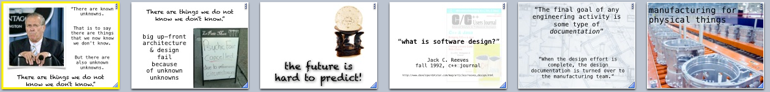
Figure 3: Excerpts from my Emergent Design presentation
Contrast this style with the “chalkboard” theme I adopted for my Functional Thinking talk, which introduces a style of programming closely related to mathematics, which visually harkens back to math class.
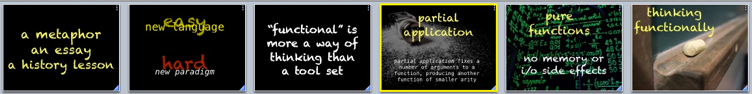
Figure 4: Excerpts from my Functional Thinking presentation
Or, consider the cleaner style I used for a talk entitled Build Your Own Technology Radar, which uses cleaner fonts and a sparser visual style, appearing in Figure 5.

Figure 5: Excerpts from my Build Your Own Technology Radar presentation
Each of these presentations has a unique Unifying Visual Theme, designed to compliment and amplify the subject rather than distract from it. My co-authors’ presentations have undergone a similar beneficial evolution now that we have an effective framework – patterns – that enables more clarity of thought about how to effectively deliver ideas.
The Journey
In many ways, the Presentation Patterns book represents my journey of discovery (along with my co-authors) of how to effectively communicate with tools. Three things made it possible. First, the constant feedback offered by conference evaluations, especially from the No Fluff, Just Stuff tour, allowed me to experiment with different styles and quickly find out what works and what doesn’t. Second, I am willing to constantly reevaluate the things I create, from source code to writing to presentations. I believe there is always room for improvement, and I constantly seek opportunities to make whatever I do better.
Third, I’m willing to follow wacky ideas to their conclusion. When I first had the flash of inspiration to apply patterns to presentations, I initially dismissed it as Yet Another Crazy Idea. But sometimes crazy ideas won’t just go away, no matter how much I tried to ignore it. Eventually, I realized I needed to write it down as a form of exorcism; writing it down finally allowed me to get it out of my head. Fortunately, I was able to find coauthors who also thought it was crazy, but not too crazy to put out into the world. So, we did.